Bootstrap Alerts
As you know Bootstrap made web designer life very easy. In this article i am going to tell you about Bootstrap Alerts.
Bootstrap Provides an easy way to create predefined alert messages.
Alerts are created with the .alert class, followed by one of the contextual classes
.alert-success
.alert-info
.alert-warning
.alert-danger
.alert-primary
.alert-secondary
.alert-light
.alert-dark:
Example:-
<div class="alert alert-success">
<strong>Success!</strong> This alert box could indicate a successful.
</div>
<div class="alert alert-info">
<strong>Info!</strong> This alert box could indicate a neutral informative change.
</div>
<div class="alert alert-warning">
<strong>Warning!</strong> This alert box could indicate a warning.
</div>
<div class="alert alert-danger">
<strong>Danger!</strong> This alert box could indicate a dangerous or negative action.
</div>
<div class="alert alert-primary">
<strong>Primary!</strong> Indicates for Primary action.
</div>
<div class="alert alert-secondary">
<strong>Secondary!</strong> Indicates less important action.
</div>
<div class="alert alert-dark">
<strong>Dark!</strong> Indicates Dark grey alert.
</div>
<div class="alert alert-light">
<strong>Light!</strong> Indicates Light grey alert.
</div>
Alert with Links
You can make hyper link in you alert message by using .alert-link class. with matching coloredExample:-
<div class="alert alert-success">
<strong>Success!</strong> You should <a href="#" class="alert-link">read this message</a>.
</div>
<div class="alert alert-info">
<strong>Info!</strong> You should <a href="#" class="alert-link">read this message</a>.
</div>
<div class="alert alert-warning">
<strong>Warning!</strong> You should <a href="#" class="alert-link">read this message</a>.
</div>
<div class="alert alert-danger">
<strong>Danger!</strong> You should <a href="#" class="alert-link">read this message</a>.
</div>
<div class="alert alert-primary">
<strong>Primary!</strong> You should <a href="#" class="alert-link">read this message</a>.
</div>
<div class="alert alert-secondary">
<strong>Secondary!</strong> You should <a href="#" class="alert-link">read this message</a>.
</div>
<div class="alert alert-dark">
<strong>Dark!</strong> You should <a href="#" class="alert-link">read this message</a>.
</div>
<div class="alert alert-light">
<strong>Light!</strong> You should <a href="#" class="alert-link">read this message</a>.
</div>
Closing Alerts
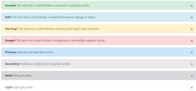
With the help of Closing alerts you can close your alert message by click X symbol. To show closing symbol you have to use Bootstrap class .alert-dismissable and then add class close and data-dismiss="alert" to a link or a button element. Whenever you will click on X symbol you alert message will disappear.Example:-
<div class="alert alert-success alert-dismissable">
<button type="button" class="close" data-dismiss="alert">×</button>
<strong>Success!</strong> This alert box could indicate a successful or positive action.
</div>
<div class="alert alert-info alert-dismissable">
<button type="button" class="close" data-dismiss="alert">×</button>
<strong>Info!</strong> This alert box could indicate a neutral informative change or action.
</div>
<div class="alert alert-warning alert-dismissable">
<button type="button" class="close" data-dismiss="alert">×</button>
<strong>Warning!</strong> This alert box could indicate a warning that might need attention.
</div>
<div class="alert alert-danger alert-dismissable">
<button type="button" class="close" data-dismiss="alert">×</button>
<strong>Danger!</strong> This alert box could indicate a dangerous or potentially negative action.
</div>
<div class="alert alert-primary alert-dismissable">
<button type="button" class="close" data-dismiss="alert">×</button>
<strong>Primary!</strong> Indicates an important action.
</div>
<div class="alert alert-secondary alert-dismissable">
<button type="button" class="close" data-dismiss="alert">×</button>
<strong>Secondary!</strong> Indicates a slightly less important action.
</div>
<div class="alert alert-dark alert-dismissable">
<button type="button" class="close" data-dismiss="alert">×</button>
<strong>Dark!</strong> Dark grey alert.
</div>
<div class="alert alert-light alert-dismissable">
<button type="button" class="close" data-dismiss="alert">×</button>
<strong>Light!</strong> Light grey alert.
</div>
If you face any problem in this code write your comment or email i will reply you ASAP


No comments:
Post a Comment